City of Portland
We’ve collaborated on a wide range of projects with the City of Portland throughout the past decade. From the Portland Plan 2030, a comprehensive guide for community decision making for the next decade plus—to the City’s municipal branding that launched in January 2022.
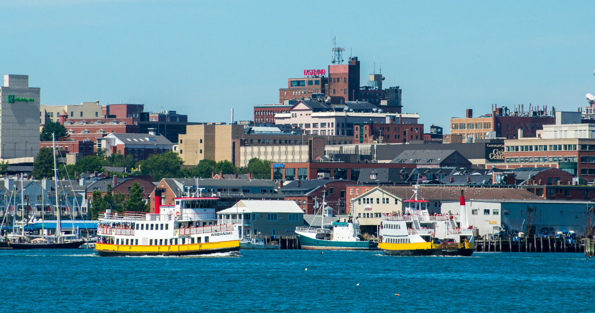
Photos of Portland: Corey Templeton
Photos of Pride: City of Portland
Indigo Design Award Winner: Silver, Branding, 2023
GDUSA American Graphic Design Award, 2022
Deliverables
Municipal branding
Comprehensive plan 2030
Portland Opportunity Crew logo & signage
Office of Economic Opportunity website
Bikeway signage
Public wifi signage
Pole banners
Trash bag insert
Pride 2022 t-shirt design
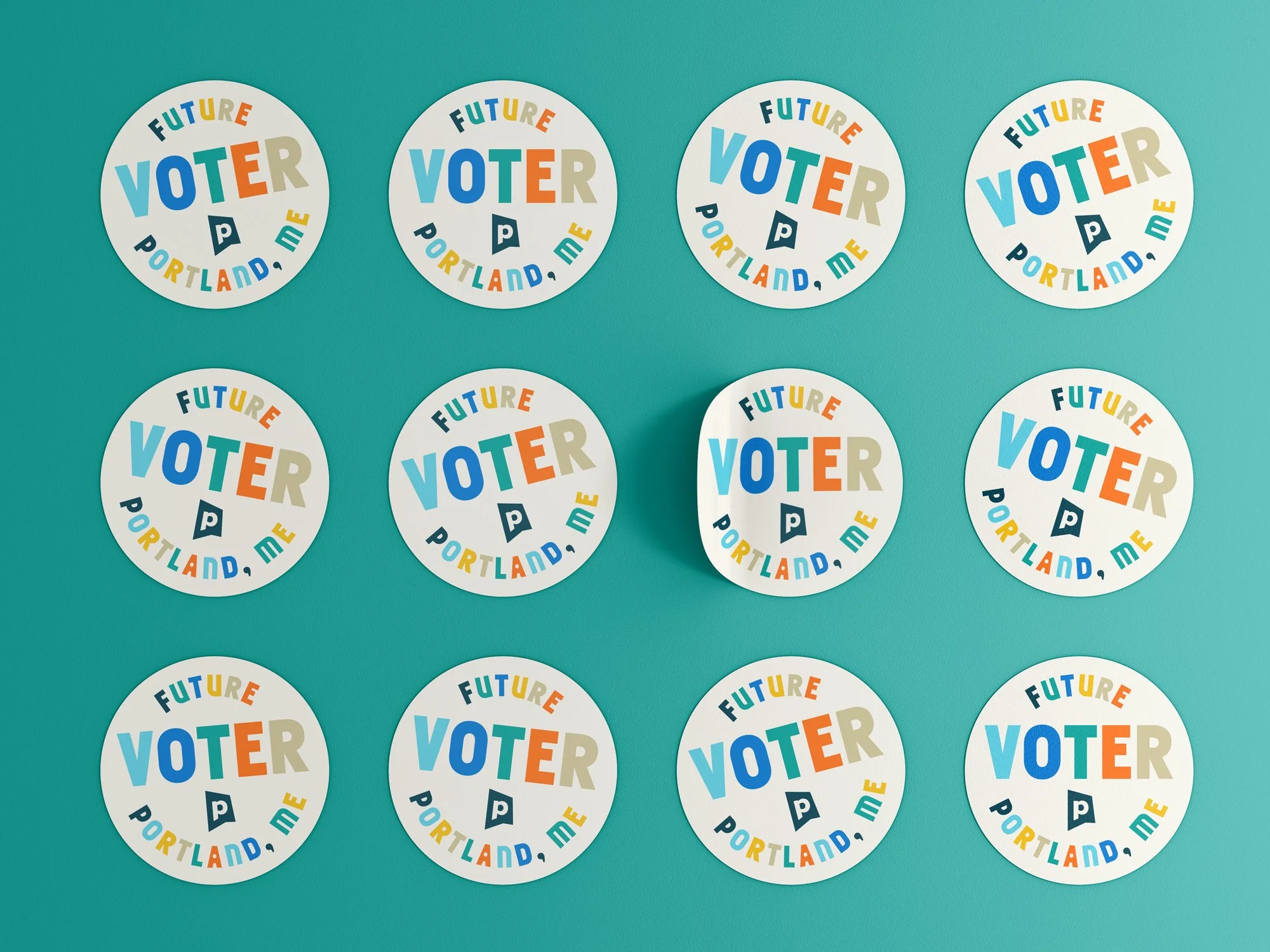
”I Voted” stickers
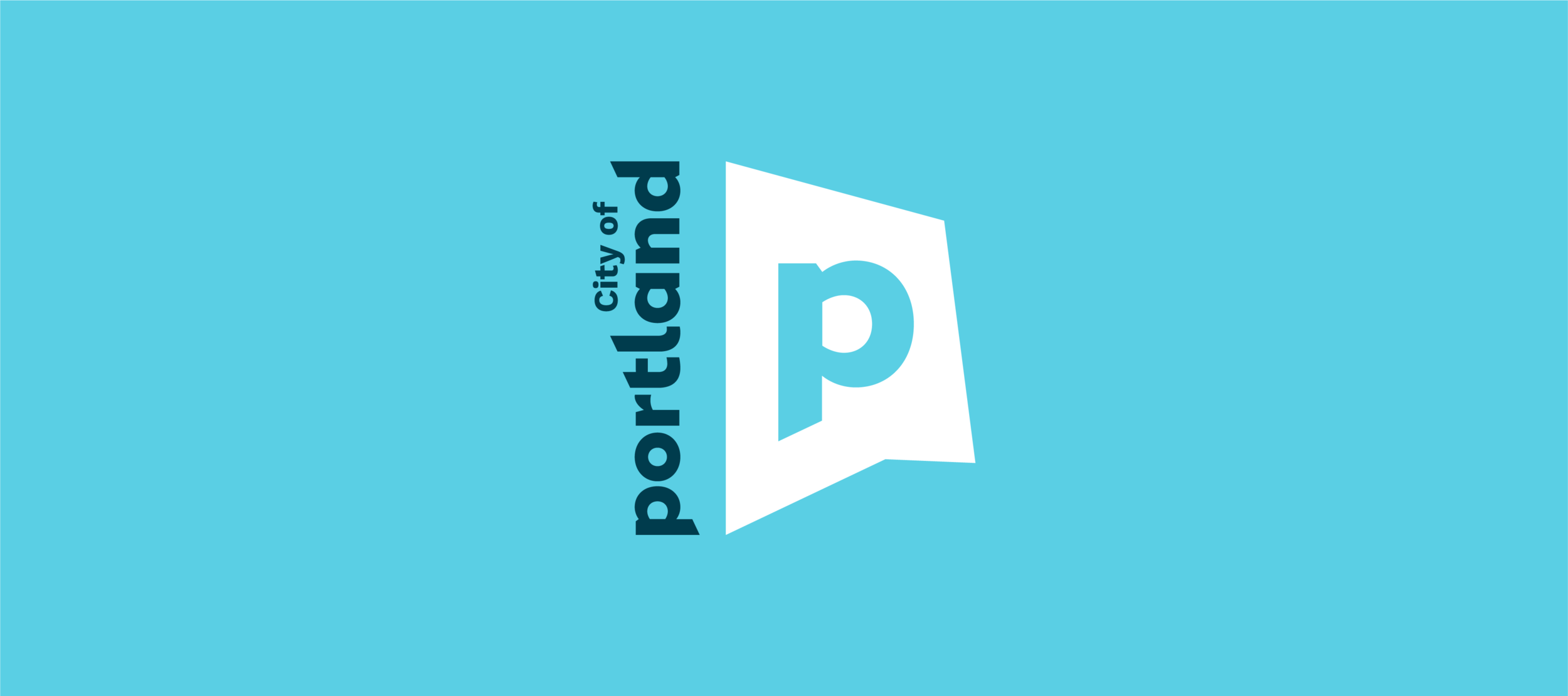
Portland Design Co developed a municipal brand intended to unify messaging across all city departments, improve awareness of the variety of services the City offers, and the physical locations that the City manages. This is known as municipal or council branding, rather than place-branding which is meant to attract business, tourism, and growth.
Municipal Brand Highlights
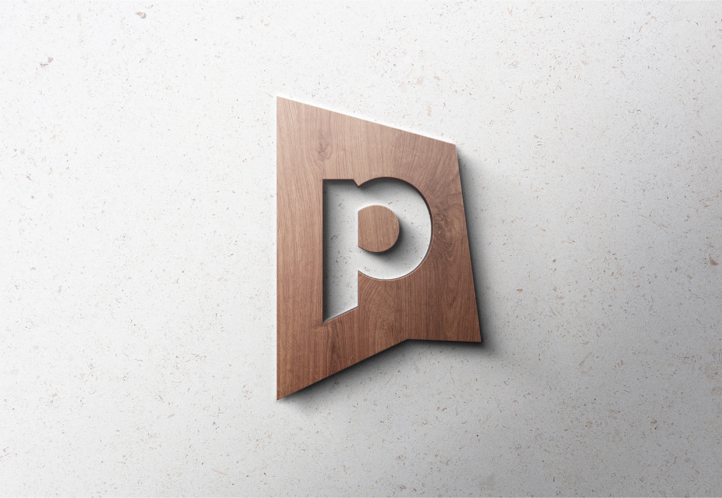
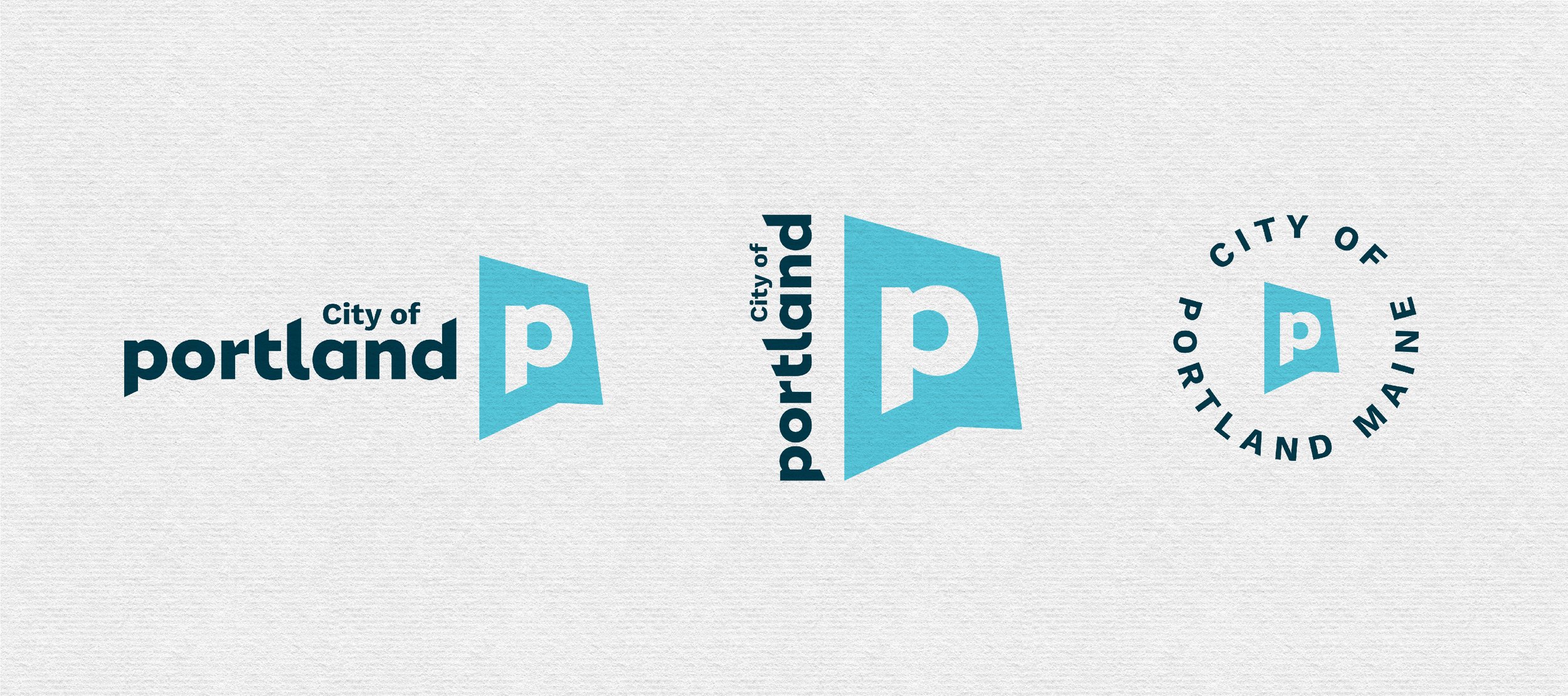
The abstract P badge brand mark reinforces the City’s communication agenda through the use of a subtle talk bubble. The mark is also an abstraction of the shape of the city. Some may also see an abstract shape of the letter P, and others have said it reminds them of the shape of the state of Maine. Abstract representation allows for creative interpretation and speaks to Portland’s diverse and evolving populations—inviting residents, business owners, as well as new and existing community members to be part of the conversation.
The wordmark’s confident yet friendly and curved letterforms represent our unique “big little city” and small-town welcomablity. The lowercase wordmark with “City of” creates an approachable sense of unity and connection by bridging the gap between the ascenders of “land” (the space between the l and the d).
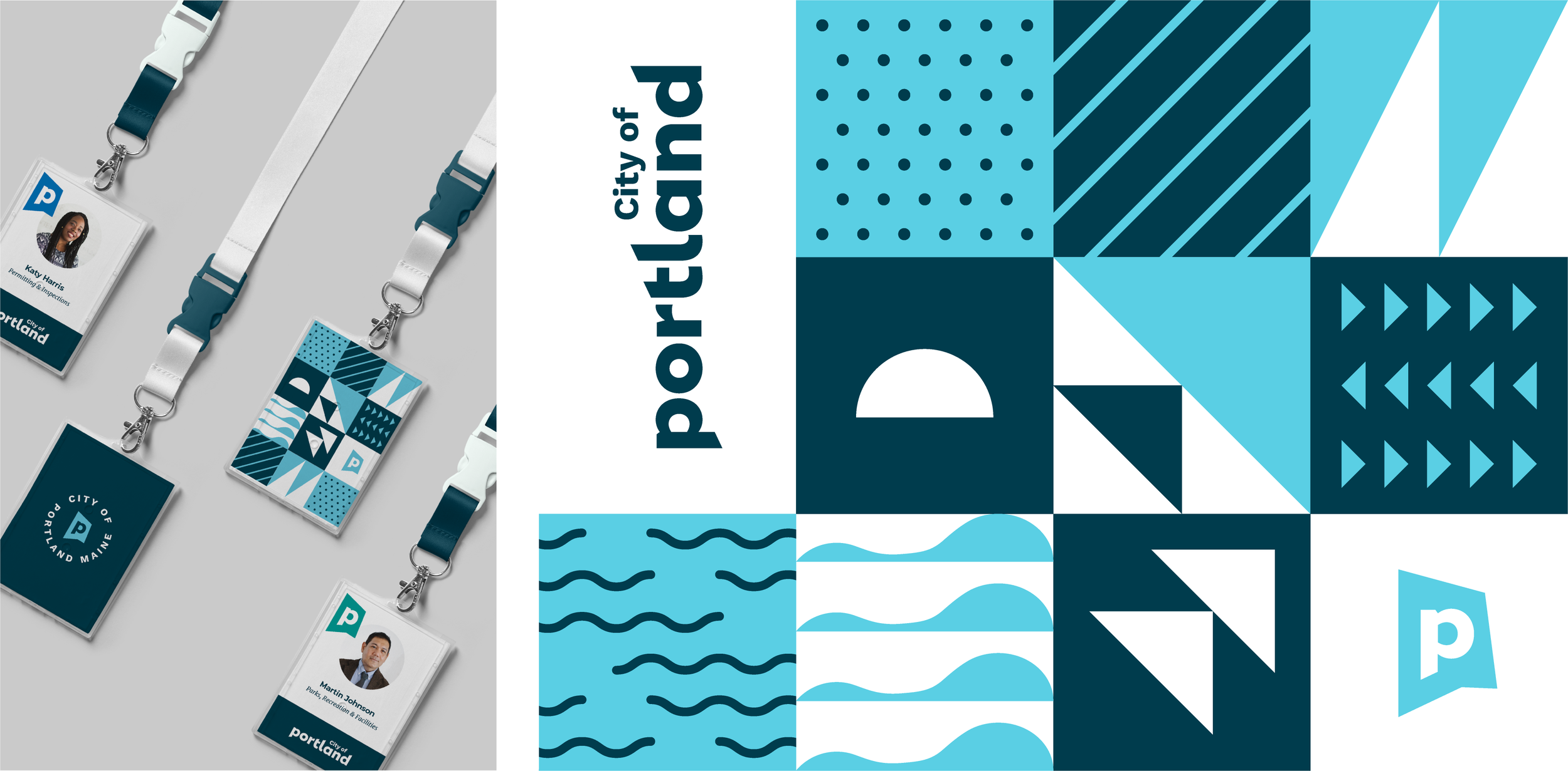
The primary logo colors—“Casco” navy and “Bay” light blue—pull from the coastal character of Portland’s location. The secondary palette, which is also assigned to City departments, give a crisp, fresh, bright take on everything the city has to offer. The “Resurgam” yellow represents a hopeful, optimistic and energetic confidence. The “Exchange” reddish orange pulls from the working waterfront and historic brick architecture. The “Parks” and “Promenade” teals/green are a nod to the City’s open green spaces and a sense of renewal. The added “Island” blue evokes reliability, trust, strength and the City’s responsibility to its people. The “Monument” color brings a subtle neutral tone to balance out the saturation of the palette as a whole.
The department logos exclusively utilize a locally designed typeface called Expo Sans. Expo was designed by Portland-based type foundry TypeCulture, founded by Mark Jamra.